- |
- ·
A landing page is a single-goal (conversion-focused) web page a visitor lands on after an ad or campaign. Below you will find what it is, how it differs from a homepage, its types, key elements (headline, CTA, form, proof), how to create one, how to measure conversion, and examples. The biggest mistake is sending ad traffic to a complex homepage.
What Is a Landing Page?
A landing page is a web page where a visitor "lands," usually by clicking an ad, email, social media link, or search result, and which is focused on a single goal or action. "Landing" means the first page a user arrives at after a campaign. Its most important feature is that it serves one purpose, a conversion: selling a product, getting a form filled out (collecting a lead), getting a signup, or prompting a download.
Unlike an ordinary web page, a landing page minimizes distractions (complex menus, lots of links) and directs the visitor toward one action. What is it for? It increases the conversion rate of marketing campaigns: it greets a visitor who arrived from an ad with a dedicated, focused page, raising the likelihood they take the desired action. In short, a landing page is a single-purpose page designed to turn a visitor into a customer or action.
Landing Page vs Homepage: What's the Difference?
The most important point in understanding a landing page is that the two serve different purposes. A homepage (or website generally) is your general entrance and is multi-purpose; it introduces your brand, links to all your products, services, pages, and information, and contains many menus, links, and options. Its goal is to give an overview and distribute visitors across the site.
A landing page, on the other hand, is focused on a single goal; it is designed for a specific campaign or offer and directs the visitor to one action (buy, sign up, fill out a form), with distracting menus and links minimized. A simple analogy: a homepage is like a store's main entrance (you can go anywhere), while a landing page is like a dedicated booth for one product (focused only on that product and getting you to take it). Sending an ad visitor to a complex homepage scatters their attention and lowers conversion, while sending them to a focused landing page increases the chance they act; landing pages usually outperform homepages at conversion, because there is no distraction and the message is clear.
Types of Landing Pages
Landing pages come in different types based on their goal. On lead generation pages, the goal is to collect a visitor's information (email, phone, name) via a form, usually in exchange for an offer (e-book, discount, demo, newsletter), and they are very common in B2B and services. Click-through pages persuade the visitor and direct them to the next step (for example a product purchase page or cart) and are used especially in e-commerce.
Sales pages focus on directly selling a product or service; they include the product's benefits, proof, and a clear "buy" call. Event and registration pages are for collecting registrations for a webinar, event, or program, while thank-you and confirmation pages are used after an action (usually post-conversion). Which type to use depends on the campaign's goal: are you collecting info, selling directly, or taking registrations? Choosing the right type ensures the page is designed to best serve that goal; the shared principle across all types is one clear goal and a focused, distraction-free design. For marketing uses of the types, international sources can help.
Key Elements of an Effective Landing Page
The must-have elements of a converting landing page are these:
- Clear, strong headline: within seconds it should answer "what is here and what is in it for me"; it is the most important element.
- Benefit-focused copy: short, persuasive copy that emphasizes the benefit the visitor will get, not just features.
- Clear call to action (CTA): a prominent, single, attention-grabbing button like "Sign up now," "Try free," or "Buy."
- Image or video and social proof: quality visuals that support the message, plus customer reviews, testimonials, and logos (which build trust).
- Simple form, focused design, mobile-friendly and fast: a short form asking only for necessary fields, focused on one action with no unnecessary menus, and quick to load on phones.
Together, these elements guide the visitor step by step toward the desired action. The golden rule is that every element should serve one goal (the conversion); remove anything that does not contribute. You can study user experience principles in Nielsen Norman Group resources.
How to Create a Landing Page (and When to Use One)
To create a landing page, first define the goal (what this page will accomplish: sale, lead, signup) and set one clear goal; clarify the audience and offer (who you are targeting and what you are offering); write the content (strong headline, benefit-focused copy, clear CTA); and design a focused, distraction-free, mobile-friendly layout with the key elements placed. To build a landing page without coding, you can use dedicated tools like Unbounce, WordPress or site-builder plugins, or page builders in email marketing platforms; then publish, drive traffic, and measure.
When should you use one? Landing pages are ideal for specific campaigns: catching paid-ad traffic (Google or Meta Ads), a product launch, a discount, an email campaign, event registration, lead collection, or promoting a specific offer. The general rule is that if you are directing people to one action via an ad or campaign, sending them to a focused landing page (not a complex homepage) boosts conversion; I covered ways to reduce ad cost in my Google Ads article. Building a separate, goal-specific landing page for each important campaign is the most effective approach.
How to Measure and Improve Conversion
A landing page's success is measured by its conversion rate, not how pretty it looks. The conversion rate is what percentage of visitors completed the desired action (purchase, form, signup); it is the core metric (for example, 5 conversions per 100 visitors equals 5%). To measure it, you use Google Analytics and your ad platforms' conversion tracking tools; bounce rate, time on page, form abandonment rate, and click-through rate are additional metrics. I gathered measurement details in my measuring digital marketing success article.
On the improvement side (conversion rate optimization), the most effective method is A/B testing: test two versions of the page (different headline, CTA, or image), measure which converts better, and test one change at a time so you know what worked. Common improvement areas are a clearer headline, a stronger CTA, a shorter form, a faster page, and better social proof; heatmaps and session recordings show where visitors get stuck. You can set up official conversion tracking through Google Analytics. Landing pages are not "set and forget"; by continuously measuring and testing, you can incrementally raise conversion.
Landing Page Examples and Tips
Successful landing page examples share common traits, and you can apply them on your own page. What is offered and its benefit are clear the moment you arrive (one clear message), a strong, attention-grabbing headline hooks the visitor in the first second, one prominent CTA clearly shows what to do, everything serves the goal with no unnecessary menus or links (simplicity), and real customer reviews, success numbers, and recognizable logos build trust (strong social proof).
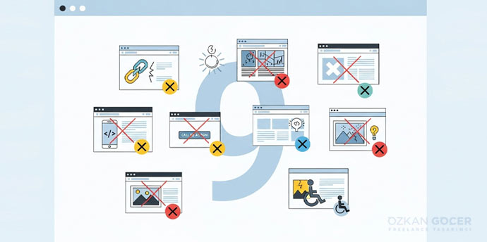
Good examples use benefit-focused copy (saying "here is what you gain" rather than "here is what we do"), are fast and mobile-friendly, and include persuasive images or video. For inspiration, click ads in your industry and study the landing pages you land on; observe the headline, CTA, page flow, and which elements they use to persuade you. Common mistakes to watch for are overly long or complex forms, a vague CTA, a slow page, a poor mobile experience, distracting elements, and a weak headline; I covered why your website is not converting in a separate article. A good landing page is simple but persuasive.
For a professional corporate site or e-commerce, you can review my web design services.
Frequently Asked Questions
Quick answers for readers who skipped to the end.
What is a landing page?
What is the difference between a landing page and a homepage?
What are the types of landing pages?
What are the key elements of an effective landing page?
How do you create a landing page, and when should you use one?
How do you measure and improve a landing page's conversion?
What does a good landing page example look like, and what should I watch for?