
- |
- ·
Logo design establishes a single visual mark to represent your brand. Brands choose from 5 main logo types: wordmark, lettermark, monogram, pictorial (symbolic), and combination. Successful marks pass three strict tests: it works in a single color, it stays recognizable at 16×16 pixels, and it still feels modern 30 years later. Development averages 2-4 weeks; hiring an experienced freelance designer requires a budget in the $500-$2,000 range. A logo forms the core of your brand identity but does not represent the whole system; you can study the broader framework in my corporate identity guide.
During my 15 years in graphic design, I have shipped more than 200 logos, working with local coffee shops, SaaS platforms, boutique jewelers, and high-volume crypto exchanges. I wrote this breakdown to bypass the shallow "open Photoshop, drop an icon, add the name" approach, sharing the concrete process I use in my own practice. Drawing is easy; defining the right problem is the real challenge. Reading to the end equips you to write a sharp brief for your designer and evaluate the resulting concepts with confidence.
What Is Logo Design? A Plain Definition
In my work as a growth engineer, I treat a logo as a brand's visual shorthand. It functions as a highly compressed identity unit. You recognize the business instantly without reading a sentence. Apple's bitten apple, Nike's swoosh, and McDonald's golden arches succeed because they deliver instant recognition. The design process builds this mark from scratch through brand strategy analysis, visual exploration, sketching, digital execution, variation development, and delivery.
Understand that a logo is not the entire brand. It represents only the most visible edge of a business, not the complete ecosystem. To build the broader system, read my corporate identity guide; to see where the logo fits within your overall design strategy, read what is graphic design.
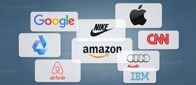
The 5 Main Logo Types
I categorize every visual identity into five distinct design frameworks:
- Wordmark: Text-only designs using custom typography. Coca-Cola, Google, FedEx, Sony.
- Lettermark: Abbreviated brand initials styled for quick recognition. IBM, HP, NASA, CNN.
- Monogram: Interlocking characters forming a single graphic unit. LV (Louis Vuitton), GE, YSL.
- Pictorial (symbolic): Graphic icons representing the brand directly or abstractly. Apple, Nike (swoosh), the Twitter/X bird.
- Combination: Integrated layouts merging text with an icon. Adidas, Lacoste, Burger King, Spotify.
In my own practice, selecting a format remains a strategic decision rather than a simple visual preference. Early-stage businesses require a combination layout to build market association between their name and graphic icon. Recognition takes time. Over years of market growth, you can transition toward a pure pictorial style, a path Apple executed between 1976 and 1998.
Which Three Tests Does a Strong Logo Pass?
In my own practice, I evaluate visual identity using strict, measurable benchmarks. I refined three specific criteria across more than 200 projects:
1. The single-color test: Does the mark retain its legibility when converted to pure black-and-white? Your design must withstand low-fidelity reproduction, including a fax machine, a newspaper ad, or an embossed stamp. Color-dependent designs lose half their effectiveness.
2. The tiny-size test: Shrink the asset to 16×16 pixels (browser favicon size). Legibility must remain intact. The mark has to perform on mobile app icons, social media avatars, and the corner of a business card.
3. The time test: Will your design look modern 30 years from now? Consider the IBM logo, which has remained unchanged since 1972 by avoiding trends. Designs relying on temporary gradients or effects look dated within five years. The Brand New (UnderConsideration) archive critiques every major rebrand; I study it constantly to avoid the trend trap.
Logo Design: From Idea to Delivery in 7 Steps
- Brief and brand excavation (2-3 hours): Mapping your target audience, competitors, brand personality, and practical constraints like industry rules, cultural sensitivities, and target market. In my own practice, skipping discovery guarantees a costly pivot three weeks later when you realize the direction is wrong.
- Visual exploration (mood board, 30-50 references): Analyzing competitor styles, selecting the correct logo family, and isolating visual directions to avoid. Visual research focuses on mapping the territory before drawing the mark.
- Sketching (pen on paper, 50-100 quick concepts): Testing dozens of ideas on paper before opening Adobe Illustrator prevents creative stagnation. Paper allows speed. Designers who start digitally often lock into a single direction too early.
- Digital concept (Illustrator, 5-10 directions): Converting the best paper concepts into vector format in Illustrator. Vectors scale infinitely without losing quality.
- Client presentation (2-3 options): Selecting and presenting the top 2-3 alternatives from the initial concepts. In the projects I have managed, offering a single option prevents healthy comparison, while presenting ten options triggers choice fatigue.
- Revision and finalize (2-3 rounds): Refining the chosen design based on your feedback. Standard design contracts include 2-3 revision rounds, and extra iterations require separate billing.
- Delivery package: Exporting vector files (AI, EPS, SVG) and raster outputs (PNG at multiple sizes, JPG). You also receive a favicon, social media profile images, dark and light background variations, and a 1-2 page brand usage guide.
5 Most Common Logo Design Mistakes
- Chasing trends: Incorporating a temporary design fad like a neon gradient dates your brand assets within three years. Focus on timeless geometry instead.
- Over-detailing: Complex vector illustrations fail on mobile screens. In the web projects I have managed, intricate lines blur into an unrecognizable smudge at 16x16 pixels.
- Cliché symbols: Placing a tooth icon on a dental clinic sign or a fork on a restaurant menu kills brand recall. You lose the chance to stand out from local competitors.
- Poor typography: Selecting Comic Sans for a corporate law firm or Times New Roman for a SaaS startup destroys credibility instantly. Font choice dictates the brand voice.
- Color-dependent identity: Relying on multi-colored gradients makes the mark useless on physical packaging or monochrome invoices. Test your design in pure black and white first.
Logo Budget: What to Expect
I break down current market rates to help you plan your design investment.
- Budget platforms (Fiverr / 99designs): $20-$200. Template-driven assets fit rapid MVPs but lack the uniqueness needed for a long-term brand.
- Junior freelance designer: $200-$600. You get a functional starting point if you run a new startup with limited capital.
- Experienced freelancer (5+ years): $600-$2,500. Mid-market companies obtain a custom brief and a structured 7-step process.
- Boutique agency: $2,500-$10,000. You receive a complete corporate identity, several design variations, and deep strategic research.
- Top-tier agency (Pentagram, Landor, Saffron): $25,000+. Global enterprises require extensive international market positioning.
In my own practice, I have managed over 200+ logo projects, mostly within the third and fourth tiers. Here, the actual value of your brand matches the depth of my creative process.
2026 Logo Design Trends (From the Field)
I gather data directly from client projects and active brand audits, replacing speculative predictions with actual market shifts.
- Geometric simplicity: Brands demand cleaner, sharper geometry, a shift visible in recent Airbnb, Mastercard, and Pinterest refreshes.
- Custom typography: Bespoke font design replaces stock typography to secure distinct brand identities. Agencies like Pentagram prioritize custom type to build separation from competitors.
- Motion identity: Dynamic, animated logo variations now appear regularly across modern websites and video intros.
- Dark mode readiness: Developers must test every asset on both light and dark backgrounds during the initial design phase.
- AI logo generators: Platforms like Looka and Logoai capture the low-budget sector. They fail to deliver serious brand identity, yet they serve well for rapid proof-of-concept testing.
For Inspiration: The Best Logo Designers
I curate design references to train my eye; you can build your own visual library using two of my articles: the world's best 18 logo designers and the 12 best graphic designers of all time. Study real-world applications through the Logo Design Love archive to understand modern case studies. If you need data-backed principles on what makes a mark successful, read Harvard Business Review's analysis of effective logo traits.
Do Not Think About the Logo in Isolation
In my own practice, I see businesses treat a logo as an independent asset. It always backfires. A logo functions only as a single component of a larger visual ecosystem. Review my corporate identity guide to see how these elements connect. Skipping this step leads to mismatched typography and inconsistent brand assets later. To select your palette, use my colors and their meanings guide to align your visuals with psychological triggers.
To build your entire brand system systematically, my graphic design services page displays real-world case studies of my past work. You can initiate your project immediately. Send a logo brief through the form in the bottom-right corner of your screen. Completing the form requires three simple steps, and I will reply with a direct evaluation within 24 hours.
Frequently Asked Questions
Quick answers for readers who skipped to the end.
What is logo design in one sentence?
How long does logo design take?
How much does a logo cost?
What are the 5 main logo types?
Which tests does a strong logo pass?
What are the steps of the logo design process?
Which software is used for logo design?
Which file formats should a logo be delivered in?
Which logo type should a new brand pick?
What are the most common logo design mistakes?
Should I buy a template logo?
Is a logo the only design element of a brand?
Are AI logo generators (Looka, Logoai) reliable?
Should I design my own logo or hire a professional?
What are the 2026 logo design trends?


