- |
- ·
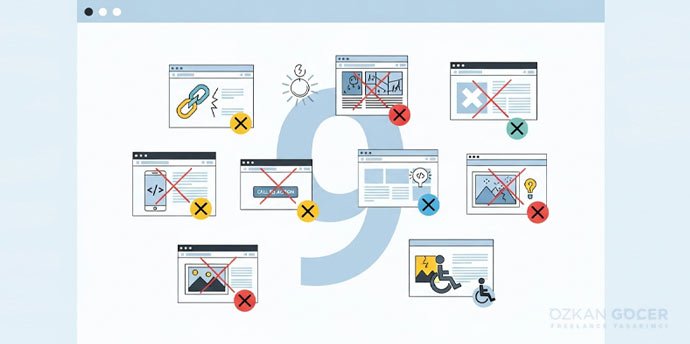
If your website gets traffic but no conversions (sales, signups, forms), that is a conversion problem. Below you will find how to measure first, then seven common reasons (wrong traffic, weak CTA, a slow and mobile-broken site, lack of trust, poor design, a weak value proposition, and form and checkout friction), and how to diagnose and fix the problem. Measure first, then fix in a targeted way.
Measure First: Is Your Conversion Rate Actually Low?
Before fixing the problem, you should measure whether there is really a conversion issue. The conversion rate is the number of conversions divided by visitors, times 100; for example, if 10 of 1,000 visitors buy, your conversion rate is 1%. You can measure this with Google Analytics and conversion tracking; I gathered the measurement method in my measuring success article.
What to look for? If you have traffic but few conversions (lots of visitors, few sales), that is a conversion problem and shows your site struggles to turn visitors into customers; if you have no traffic at all, that is a different problem (an SEO or traffic issue, not conversion). Low conversion is relative, and a normal rate varies by industry and product, but if your conversion is dropping over time or far below similar businesses, something is wrong. To see where people drop off, examine your conversion funnel: at which step do visitors leave (product, cart, checkout)? Heatmaps and session recordings also reveal where users struggle. Set up official measurement through Google Analytics; rather than changing things blindly, rely on data.
Reason 1: Wrong or Low-Quality Traffic
One of the most overlooked yet most important reasons is wrong or low-quality traffic. Getting lots of visitors does not mean getting the right visitors; if the people arriving are not genuinely interested in what you sell, they will not convert no matter how good your site is, which is exactly why you can get clicks but no conversions. The causes include an off-target audience (your ads or SEO reach people uninterested in your product), irrelevant keywords (people seeking information arrive, but you are selling, so intent mismatches), wrong ad targeting, and a misleading message (if the ad promises one thing and the site delivers another, the visitor leaves disappointed).
How can you tell? A high bounce rate, very short time on page, and zero conversions can indicate irrelevant traffic. The fix is to focus your traffic on the right, purchase-intent audience: narrow your ad targeting, target the right keywords, and keep the ad and page message consistent. Sometimes less but more relevant traffic converts far better than lots of irrelevant traffic; I covered ad targeting and cost in my Google Ads article. A big share of conversion problems are actually traffic-quality problems.
Reason 2: Unclear or Weak Call to Action (CTA)
A very common problem is an unclear, weak, or missing call to action (CTA). If a visitor arrives but does not clearly understand what to do, they leave without acting; you have to tell people clearly what to do. Common mistakes: no prominent "Buy," "Sign up," or "Contact us" button, vague phrases like "Submit," a button that does not stand out (buried at the bottom or faded), too many different CTAs scattering the visitor, and wrong timing (pushing a sale before the visitor is convinced).
The fix is this: have a clear, single, prominent CTA on every important page; make the text action-oriented and specific ("Try free," "Buy now"); make the button stand out with color, size, and position; show the visitor what they will gain ("Order with free shipping"); and reduce distracting options. A clear CTA takes the visitor by the hand to the next step, and it is often one of the fastest fixes to boost conversion; I explained CTA and landing page design in detail in my landing page article.
Reason 3: Slow Site and Bad Mobile Experience
Two technical factors directly hurt conversion: a slow site and a bad mobile experience. Visitors are impatient; if a page loads slowly (especially more than a few seconds), people leave without waiting, and a slow site loses visitors and damages the perception of trust. To improve speed, compress and optimize images, reduce unnecessary plugins and code, use good hosting, use caching and a content delivery network (CDN), and remove unnecessary redirects; tools like PageSpeed Insights show your speed problems and suggested fixes.
Most traffic today is mobile; if your site looks bad or is hard to use on a phone (tiny text, hard-to-tap buttons, broken layout, horizontal scrolling), mobile visitors will not convert. The fix is to use responsive design, make buttons and forms easy to tap on mobile, keep text readable, and test the mobile experience on a real phone. In short, a fast, mobile-friendly site is a basic requirement for conversion; even the best content will not work on a slow or mobile-broken site. Fixing these two technical issues noticeably boosts conversion on most sites.
Reasons 4-5: Lack of Trust and Poor Design/UX
Two important conversion killers are lack of trust and poor design. People will not buy from or share info with a site they do not trust; signs of low trust are no customer reviews, unclear contact info, missing security (SSL or https), an unprofessional design, typos, and an unclear return policy. The fix is to add real customer reviews and testimonials, include clear contact info and an "about" page, use security and SSL, provide a clear return and privacy policy, and ensure a professional look; trust signals are decisive for conversion, especially for new and unknown brands.
Poor design and user experience (UX) also tire and lose visitors: confusing navigation, an overcrowded page, no clear flow guiding the user, intrusive pop-ups, and hard-to-find information are the main problems. The fix is to simplify the design, build clear and logical navigation, guide the visitor step by step toward the goal, reduce distractions, and make the page easy to use. The golden rule of good UX is that the visitor should not have to think about what to do; trust plus a simple, clear experience lets visitors act comfortably. You can find UX principles in Nielsen Norman Group resources.
Reasons 6-7: Weak Value Proposition and Form/Checkout Friction
There are two more reasons: a weak value proposition and form and checkout friction. If a visitor cannot quickly and clearly find the answer to "what is in it for me, and why should I buy here," they will not be convinced; a common mistake is talking about yourself ("we are X") but not stating the visitor's benefit, and if your difference from competitors is not clear, the visitor cannot decide. The fix is to use a clear, benefit-focused message ("here is what you gain"), highlight what sets you apart, address the target audience's real need, and show the before-and-after benefit you provide.
Form, cart, and checkout friction is the leading cause of losing visitors right at the point of conversion. Overly long or complex forms (unnecessary fields), forced account creation (no guest checkout), hidden costs and surprise shipping fees (appearing at checkout), a complicated checkout process, limited payment options, and technical errors are the main problems. The fix is to shorten forms (only necessary fields), allow guest checkout, show costs transparently upfront, reduce checkout steps, offer multiple payment methods, and test the cart and checkout flow on every device. Once a visitor decides to buy, every obstacle in their path loses them, so make those final steps as smooth as possible.
How to Detect and Fix It
Improving conversion (conversion rate optimization) is systematic; proceed with data, not guesses. First, detect:
- Set up analytics: use Google Analytics and conversion tracking to measure where traffic comes from and which pages do not convert.
- Examine the funnel: at which step do visitors leave (landing, product, cart, checkout)? Focus on the step with the biggest drop-off.
- Heatmaps and recordings: where do users click, get stuck, or stop scrolling?
- Mobile and speed: check technical issues with tools like PageSpeed.
- Real feedback: if possible, get feedback from real users and customers.
On the fix side, the most reliable method is A/B testing: test one change (a new headline, a different CTA, a shorter form) with two versions, measure which converts better, and test one change at a time. Use the reasons in this article as a checklist (traffic quality, CTA, speed and mobile, trust, UX, value proposition, form and cart) and start with the biggest-loss problems. To continue the process by observing visitor behavior, heatmap tools are useful; measure first to narrow the problem, then make targeted fixes and test. Even small but correct improvements add up to big conversion gains over time.
If you want a conversion-focused, fast, SEO-friendly site, you can take a look at the web design services I offer.
Frequently Asked Questions
Quick answers for readers who skipped to the end.
How do I know my site is not converting, is my rate actually low?
Why am I getting clicks but no conversions, is it the traffic?
How does the call to action (CTA) affect conversion?
How do a slow site and bad mobile experience lower conversion?
How do lack of trust and poor design hurt conversion?
How do a weak value proposition and form or checkout problems lower conversion?
How do I detect and fix my conversion problem?