- |
- ·
A good logo is simple, memorable, timeless, versatile, and appropriate to the brand; icons like FedEx, Apple, and Nike show the power of these principles. Logo types split into wordmark, lettermark, pictorial, abstract, mascot, and combination. The guide below covers what makes a good logo, the types with real examples, creative designs, color and typography principles, small-business examples, how to create one, and inspiration sources.
What Makes a Good Logo?
A good logo is one understood at a glance and remembered for a long time. The design world agrees on five core principles: simplicity, memorability, timelessness, versatility, and being appropriate to the brand. A complex logo can look impressive, but it falls apart when it shrinks or drops to a single color.
Simplicity is the source of strength; Nike's single-line swoosh or Apple's bitten apple are the strongest logos in their most minimal form. Timelessness means resting on a lasting idea rather than a trend; a logo still fresh a decade later is worth more than one chasing fashion. In the brand projects I have managed, the strongest logos were almost always the simplest.
Versatility is a critical measure too. A logo should work with equal clarity in a tiny favicon, on a giant sign, on a black-and-white invoice, and on a color screen. Running these tests early in the design process prevents expensive fixes later.
Types of Logos (With Examples)
Logos split into six main types by structure, and each suits a different brand. Choosing the right type is the first step in carrying a brand's personality into a visual.
Wordmark
A wordmark writes the brand name in distinctive typography; Google, Coca-Cola, and FedEx are classic examples. It is ideal for short, memorable names, because the name itself becomes the logo. The right typeface choice decides everything here.
Lettermark/Monogram
A lettermark uses the brand's initials and simplifies long names; IBM, HBO, CNN, and NASA are well-known examples. Reduced to a few letters, the brand gains an identity that is easy to remember and to use in small spaces. It is often chosen by corporate and formal brands.
Pictorial/Symbol
A pictorial logo tells the brand through a recognizable image; Apple's apple, Twitter's bird, and Target's target belong here. A symbol recognized without the name is the strongest brand asset, but reaching that point takes time and recognition. For new brands, it can be risky on its own.
Abstract
An abstract logo uses a geometric or conceptual shape rather than a concrete object; Nike's swoosh and Pepsi's globe are examples. It conveys a feeling or motion without tying it to a specific object. It gives the brand a distinctive, flexible identity.
Mascot
A mascot logo uses a character that represents the brand; KFC's Colonel, the Michelin Man, and Mailchimp's monkey are known examples. It works for warm, friendly brands, especially those speaking to families or children. The character adds a face and a narrative to the brand.
Combination and Emblem
A combination logo uses text and a symbol together; Lacoste and Burger King are examples of this flexible type. An emblem places the text inside a symbol; the Starbucks and Harley-Davidson badges rest on this tradition. Both are strong, but an emblem can strain legibility at small sizes.
| Type | Definition | Example |
|---|---|---|
| Wordmark | Name in distinctive type | Google, FedEx |
| Lettermark | Initials | IBM, HBO |
| Pictorial | Recognizable image | Apple, Twitter |
| Abstract | Geometric/conceptual | Nike, Pepsi |
| Mascot | Character | KFC, Michelin |
| Combination/Emblem | Text + symbol | Lacoste, Starbucks |
Logo Examples by Category (Industry and Style)
A logo's style changes with the industry it speaks to, because each sector has its own visual language. Technology brands tend to prefer simple, geometric, blue-toned logos because they want to convey trust and innovation. Food and drink brands lean toward appetizing warm colors and rounded shapes.
Luxury brands build prestige with elegant thin serifs and a black-and-gold palette, while children's and entertainment brands catch warmth with bright colors and playful shapes. Matching the style to the sector is not mandatory, but it should be a conscious choice; breaking a rule knowingly beats following it by accident.
Creative and Famous Logo Examples
The most memorable logos often carry a hidden detail or a clever idea. The FedEx logo holds a hidden arrow in the negative space between the "E" and the "x," hinting at speed and direction. The smile under Amazon is actually an arrow stretching from "a" to "z," saying it sells everything.
Similar clever touches hide in many famous logos; even if you do not notice at a glance, they work on the subconscious.
- FedEx: a hidden arrow in the negative space between letters.
- Amazon: an arrow shaped like a smile, running from "a" to "z."
- Toblerone: a bear hidden inside the mountain image.
- Baskin Robbins: the number "31" inside the letters for its 31 flavors.
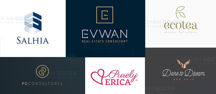
Small Business Logo Examples
A small business does not need a complex logo; it needs a clear, versatile one. A clean wordmark or a simple combination mark usually serves better than an elaborate illustration, because it stays readable on a sign, a receipt, and a phone screen. Starting simple also keeps design and printing costs down.
The smartest move for a small brand is to pick one strong idea and apply it consistently across every touchpoint. A logo that works in one color, scales cleanly, and fits the business's character will outperform a trendy design that looks dated in two years.
How to Create a Logo (DIY / Designer / AI)
There are three main ways to create a logo, and the choice depends on your budget, time, and how important the brand is. DIY tools like Canva and Looka are fast and cheap, but originality and flexibility are limited. A professional designer or agency gives the most original result and asks for a higher budget in return.
AI logo generators have recently offered a fast starting point, turning the idea you describe into a draft in seconds. Still, it is wise to treat the AI output as a start; for an original and copyright-clean logo, refining the result with a designer is the safest path.
- DIY: Canva, Looka, Hatchful; fast and cheap, with limited originality.
- Designer/agency: the most original and strategic result, at a higher budget.
- AI: a fast draft; refine by hand for copyright and originality.
Logo Design Principles (Color and Typography)
Color and typography carry a logo's personality as much as its shape. The "rule of three" suggests using no more than three colors, and most strong logos settle for one or two; fewer colors keep the brand consistent and lower printing costs. A logo should also work in pure black and white, with color as an accent rather than the only leg it stands on.
Typography sets the tone just as strongly: a serif feels traditional and trustworthy, a clean sans-serif feels modern, and a custom typeface signals a distinctive brand. Pair the type with the brand's character, and avoid overused or hard-to-read fonts. Build a strong shape first, then add color and type as layers.
Logo Inspiration Sources and Tools
A good logo starts with good inspiration research. Platforms like Dribbble, Behance, and Logobook offer thousands of professional examples; studying your competitors and sector shows which visual language works. Drawing inspiration is not copying; the goal is to find direction and avoid cliches.
On the design side, Figma and Adobe Illustrator are the professional standard, while sources like Smashing Magazine and the Nielsen Norman Group deepen your grasp of design principles. Thinking of your logo alongside a business card and other materials is the key to building a consistent identity.
Frequently Asked Questions
Quick answers for readers who skipped to the end.
What is a logo, can you give an example?
What are the types of logos?
What is the rule of three colors in a logo?
How do you create a logo?
What makes a good logo?
How much does logo design cost?
Why should a logo be vector?
What do creative logo examples look like?
What is the difference between a logotype and an emblem?
What tools are used in logo design?
Which colors and typography should a logo use?
Is it right to use a ready-made/free logo template?