- |
- ·
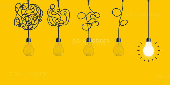
Packaging design is the visual and structural design of a product's outer package; it protects, informs, and represents the brand. Below you will find why it matters, from strategy to concept, from the dieline to software, from legal labeling to sustainability, step by step. The two most-skipped things are the dieline and labeling regulations.
What Is Packaging Design and Why Does It Matter?
Packaging design is the visual and structural design of a product's outer package (box, bottle, pouch, label). It is far more than wrapping a product; it protects, carries, informs, and most importantly represents the brand. Even studying the packaging of brands you like on design platforms teaches a lot.
Why does it matter? Among dozens of competitors on a store shelf, what first catches a shopper's eye is often the packaging; good design makes the product visible. Research shows packaging plays a strong role in purchase decisions, and attractive, trustworthy packaging can boost sales. Packaging communicates a product's quality and identity (a luxury product and a budget product should be packaged differently), presents required details, and especially through the "unboxing" experience can build brand loyalty. In short, packaging is a silent salesperson: it protects the product while also selling it and telling the brand's story.
1. Analysis and Strategy: Before You Design
Good packaging design begins with analysis before you start designing. Answer these questions first: what is the product, what are its features and benefits, and how must it be protected (fragile, food, liquid); who is the target audience (age, income, lifestyle, tastes) and the packaging should "speak" to them; and what is your brand's tone (luxury or budget, modern or classic) so the packaging stays consistent with it.
Competitor analysis is also needed: how do competing products on the shelf look, and how will you stand out (if they are all blue, a different color could make you pop). Also define the key message the packaging must convey (natural, premium, economical, fun) and the practical needs (package type, size, shelf conditions, shipping, cost). Skipping the strategy phase yields a pretty but ineffective package; starting with the right questions both directs the design toward its goal and saves time in later steps.
2. Concept, Color Psychology, and Typography
In the concept phase you build the packaging's visual language, where color and typography play a decisive role. Colors send strong emotional signals and influence purchase decisions:
- Green: usually suggests natural and healthy.
- Red: energy and appetite.
- Blue: trust and calm.
- Black and gold: a luxury and premium feel.
Choose colors to fit your brand, the product category, and your audience, and mind standing out from competitors. Typography reflects the brand's voice, and readability is essential, because the product name and key info must be legible from shelf distance; pick brand-appropriate, clear, harmonious fonts and avoid using too many different ones. Visual hierarchy (the most important element should be most prominent), quality imagery, simplicity, and brand consistency make the design strong. I also covered color and typography choices in my logo design article.
3. The Technical Side: The Dieline and Vector Design
Beyond visuals, packaging design has a crucial technical side; skipping it leads to print disappointments. The dieline is the technical template of the package in its flat, unfolded form; it shows the cut lines, fold lines, and glue areas. You design on top of this dieline so the design lands in the right places when the package is folded into 3D. Without a dieline, a design can be cut or folded in the wrong places when printed.
Packaging should be designed in vector, because it is printed at various sizes and must stay crisp; a bleed should be left so there is no white edge after trimming, print usually uses CMYK color mode (not RGB, which is for screens), and any images used should be high resolution. Learn your printer's required file format and technical specs in advance. I explained the format and vector logic in detail in my graphic design file formats article; technical prep is one of the biggest differences between professional and amateur packaging.
What Software to Use (and Designing Your Own)
The core tool of professional packaging design is vector software, since packaging is printed at various sizes and must be scalable. Adobe Illustrator is the industry standard for packaging; it is the most powerful tool for dieline creation, vector graphics, typography, and print prep, and most professional packaging is done in Illustrator. Photoshop helps with image and texture work, InDesign is useful for text-heavy packaging or labels, and 3D and mockup tools provide a 3D preview of the package.
Affinity Designer and CorelDRAW are Illustrator alternatives. If you want to design your own, for simple needs tools like Canva let you make basic packaging with ready templates; but for professional, print-ready packaging (with a proper dieline, vector graphics, and correct print settings), vector software and technical know-how are essential. The recommendation for beginners is to first learn vector design logic and Illustrator; DIY is fine for small needs, but serious packaging benefits from professional tools and, often, a professional designer.
The 4 C's, 5 P's, and 3 C's of Packaging
Popular frameworks summarize what good packaging should achieve (sources phrase them slightly differently, but the spirit is consistent):
- The 4 C's: Contain (hold and protect the product), Convenience (easy to handle, open, and use), Communicate (convey brand and product info clearly), and Conserve/Cost (protect quality, be cost-effective and sustainable).
- The 5 P's: Product, Protection, Promotion, Planet (sustainability), and Price/Practicality.
- The 3 C's: Clear, Concise, and Compelling, meaning the message should be easy to understand, uncluttered, and persuasive.
Note that these acronyms are not rigid industry standards and vary by source, so treat them as helpful checklists rather than fixed laws. Their shared lesson is that great packaging protects, informs, persuades, and respects both cost and the environment. Keeping them in mind helps you design (or evaluate) packaging that does its full job.
Legal Labeling and Sustainability
Packaging must meet legal and functional rules, not just look good. Especially for food products in the US, the FDA requires specific information on packaging: the ingredient list, net quantity, the Nutrition Facts panel, allergen declarations, the name and address of the manufacturer or distributor, and more. Cosmetics, supplements, and drugs have their own labeling rules under the FDA and other agencies. Omitting required information creates legal problems, so always check current regulations (and consult a specialist if needed); you can review labeling guidance at the FDA.
Beyond that, required information should be a readable size and clear, packaging must not misrepresent the product (such as depicting a fruit that is not in it), it must actually protect the product (durability, sealing), open and ship easily, fit the shelf it will sell on in size and durability, be cost-practical to produce, and be original (imitating another brand carries trademark and copyright risk). Sustainability matters increasingly: preferring recyclable or biodegradable materials, avoiding excess packaging (enough but not wasteful), and reducing single-use plastic are the main approaches. It has two benefits: environmental responsibility and consumer preference (especially younger shoppers favor eco-conscious brands), so sustainable packaging can be both ethical and a commercial advantage. For professional help, freelance platforms are a place to start. It is general information here, not legal advice.
Frequently Asked Questions
Quick answers for readers who skipped to the end.
What is packaging design and why does it matter?
What should I do before starting to design packaging?
How do I choose color and typography for packaging?
What is a dieline, and how is packaging prepared technically?
What software should I use, and can I design packaging myself?
What are the 4 C's, 5 P's, and 3 C's of packaging?
What legal labeling and sustainability factors should I consider?