- |
- ·
Graphic design for businesses is about building trust and recognition more than just looking nice. Below you will find why graphic design adds value to your business, how to build a consistent brand identity, color and typography choices, simplicity and visual hierarchy, the right and royalty-free image sources, which tools to use, and the mistakes to avoid.
Why Does Graphic Design Matter for Business?
Graphic design is not just aesthetics for a business but a direct tool of communication and trust. Good design makes your brand look professional, conveys your message in seconds, and sets you apart from competitors; bad design does the opposite and creates distrust. There are a few core principles that work best for businesses:
- Consistency: the same logo, colors, and font everywhere.
- Simplicity: fewer elements, a clear message.
- Hierarchy: the most important information in the most visible place.
- Readability: sufficient contrast and clear typography.
- Fit to goal: a tone suited to your audience and industry.
Below I cover how to apply each principle in practice. You can also find the basic language of design in my logo design article.
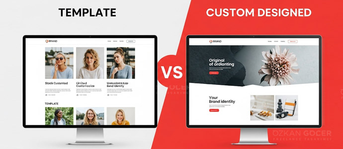
Build a Consistent Brand Identity
The backbone of business design is a consistent brand identity. Your logo, color palette, fonts, and visual style should be the same everywhere, from your website to social media, from a business card to an invoice. Consistency makes your brand recognizable and reinforces trust at every touch; a scattered brand that looks different everywhere gives an amateur impression. Creating a small brand guide (color codes, font list, logo usage rules) keeps consistency no matter who designs. I cover how a professional logo is built, with examples, in my best logo designers article.
Choosing Color and Typography
Color and font are a brand's silent language. Colors carry emotion and association; choosing a palette suited to your industry and the feeling you want conveys your message without words. A consistent palette limited to two or three main colors is always stronger than a scattered, rainbow-like design. Typography matters as much as color: use readable fonts that fit the brand's character, and a limited number (usually one or two). I cover the meanings of colors in my colors and meanings article and font choice in my typography article.
Simplicity and Visual Hierarchy (Less Is More)
The secret of good design is often not what you add but what you remove. The "less is more" principle is especially true in business design: too many elements, too many colors, and too much text smother the message and tire the eye. Use whitespace not as an enemy but as breathing room. Visual hierarchy means guiding the eye in the right order: the most important information should be the largest and most visible, secondary details below. When looking at a design, the viewer should instinctively know where to look first; simplicity and hierarchy together are the line that separates professional from amateur design.
The Right Images and Royalty-Free Sources
The images you use directly affect your brand's quality. Blurry, stretched, or irrelevant images damage professionalism; clear, consistent images that fit your brand build trust. Watch copyright too: using an image randomly downloaded from the internet can create legal problems. Instead, use royalty-free (free or licensed) stock image sources; I gathered the options in my free royalty-free stock image sites article. Producing your own original images where possible makes your brand unique and sets you apart from the cliché images repeated across thousands of sites.
Design Tools (Canva or Professional?)
The right tool depends on your skill level and need. For beginners and quick work, template-based tools like Canva make it easy to produce professional-looking social media images, presentations, and simple graphics without being a designer. For more advanced and original work, the Adobe ecosystem (Photoshop, Illustrator) is the industry standard but has a steeper learning curve. For inspiration and professional examples, you can browse platforms like Behance. For most small businesses, Canva covers daily needs; a custom brand identity and complex work call for a professional tool or designer.
Common Mistakes and When to Hire a Professional
Finally, avoid the most common mistakes: inconsistent brand use, too many colors and fonts, unreadable small text, low-resolution images, and blindly copying trends. If a design feels "crowded," it usually needs simplifying. Also know how far you can go yourself: tools are enough for social media images and simple graphics, but for a logo, corporate identity, and work that will be the face of your brand, investing in a professional designer usually pays off long-term. Good design is not an expense but an investment in trust in your brand; you can deepen design principles in design sources.
Frequently Asked Questions
Quick answers for readers who skipped to the end.
Why does graphic design matter for my business?
How many colors and fonts should I use in my brand?
Why is brand consistency so important?
Can using copyrighted images cause problems?
Is Canva enough for professional design?
When should I hire a professional for design?
What is the most important rule of good business design?