- |
- ·
Catalogs and brochures are two of the strongest print (and now digital) tools for promoting a brand or product, but their scope differs. A catalog presents a product range in an organized way, while a brochure delivers a single message briefly and strikingly. Below you will find the difference between the two, their types, the common features of good examples, how they are prepared step by step, the school-assignment brochure and template sources.
Catalog and Brochure: The Key Difference and When to Use Each
Catalogs and brochures are often confused, yet their functions differ. A catalog is a publication that presents a company's product or service range in a detailed, multi-page form; its aim is to give the customer an organized resource and make the buying decision easier. A brochure is usually a single sheet or a few pages and promotes one topic, product or event briefly and persuasively.
Remembering the order of scope makes the choice easier: a flyer is the shortest and single-message, a brochure is mid-scope, and a catalog is the broadest. For announcing a single campaign a flyer fits, for explaining a service or event a brochure fits, and for showcasing all products a catalog fits. The most common mistake I see among the businesses I advise is having a thick catalog made when a short promo would do, wasting both the budget and the reader's attention.
Catalog Types and Example Categories
Catalogs take different forms by your purpose. Which type you pick depends on whether you want to sell or promote and on your audience.
Product catalog and price list
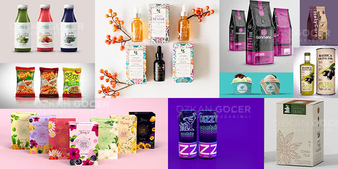
The product catalog is the most common type, presenting products with visuals, descriptions and features; the price-list catalog highlights products and prices. For businesses with many products, a categorized, easy-to-browse product catalog is the backbone of sales.
Corporate and promotional catalog
The corporate catalog tells about the company, its services and values; it builds a sense of trust and professionalism rather than selling products. At fairs and in sales meetings, it works like the brand's showcase.
E-catalog (digital/PDF)
The e-catalog is a digital catalog viewed online that can hold links and animation. It is distributed for free, updated easily, and you can measure how many people opened it; today most businesses prepare an e-catalog first.
Brochure Types and Fold Styles
Brochures vary in both content and form. The length of your message, your budget and how you distribute it decide which type you pick.
Promotional and product/service brochures
A promotional brochure tells about a company or brand, while a product/service brochure explains a specific product or service. Event and information brochures (school, health, public) are common types too. Their shared goal is to carry the most important message in little space.
Tri-fold brochure and flyer
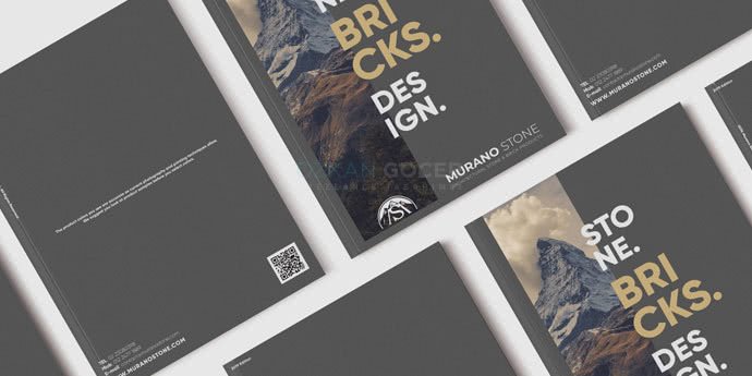
The most popular form is the tri-fold brochure, where an A4 is folded into three and forms six panels; it presents organized information in little space. Bi-fold and single-sheet forms also exist. A flyer is the unfolded, single-message and cheapest option. When designing a tri-fold, you should treat each panel as a separate page and plan the information flow by the order it opens.
Common Features of a Good Catalog and Brochure Example
Whether a catalog or a brochure, effective examples rest on the same foundations. The most decisive element is visual quality; blurry or poorly lit photos collapse even the flashiest design.
- An eye-catching cover/front: an opening that reflects the brand and draws interest.
- Clear, airy layout: readable, consistent pages with plenty of white space.
- Quality visuals: high-resolution, professional photos.
- Brand consistency: logo, color and typography aligned throughout.
- Hierarchy and a call to action: important information stands out, with a clear "call/visit/order" prompt.
I covered in detail why visual quality is so decisive for a business in my article on graphic design for businesses. A good example carries the most important information without tiring the reader and moves them to act.
How to Prepare a Catalog or Brochure (Step by Step)
Both materials are prepared with the same logic; the difference lies in scope and page count. Good content preparation is half the design; rushed content weakens even the best layout.
- Define the purpose and audience (sell or promote; for whom?).
- Gather the content: product/service list, descriptions, prices, quality visuals.
- Plan the structure: cover, contents, categories, panel or page order.
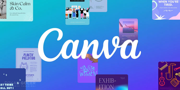
- Design a layout that fits the brand identity (with tools like Adobe InDesign or Canva).
- Place the visuals and text and build the hierarchy.
- Review spelling, prices, visual quality and brand consistency.
- Export: a print-ready PDF for print, an e-catalog for digital.
How to Make a School/Assignment Brochure
School-assignment brochures (promoting a topic, a city, a book or a health or environment theme) can be made by hand or digitally. For the handmade version, fold an A4 into two or three, divide it into sections; place a title and image on the front, and the information on the inner pages with short headings and visuals, decorating with colored pens and neat writing.
If you want digital, you can pick a "brochure" template in a free tool like Canva, add text and visuals, and print it. Tips: explain the topic briefly and clearly (a heading plus a few sentences, not long paragraphs), use visuals, stay neat and tidy, make the title catch the eye, and include everything the teacher asks for (title, content, visual, source).
Where Can I Find Templates and Examples?
There are a few solid sources for inspiration and ready templates. Behance is ideal for studying professional designers' catalog and brochure projects; Canva and Visme offer free, editable templates.
While taking inspiration, instead of copying examples as they are, adapt the layout you like to your own brand or assignment topic. Ready templates save time at the start; still, personalizing the color, logo and tone matters for a professional result. For an original, corporate need, working with a graphic designer gives the best outcome.
Print or Digital (E-Catalog)?
Both have advantages, and using them together is usually best. Print material offers a tangible prestige and permanence at fairs, in stores and in face-to-face sales, but it has a printing cost and is hard to update. Digital (an e-catalog or PDF brochure) is distributed for free, updated easily, can hold links and video, is clickable and measurable, and is also eco-friendly.
Which one you prioritize depends on your audience and where you use it: if you sell mostly digitally, the e-catalog stands out, and if you rely on fairs and stores, print does. The ideal is being able to use the same design in both formats. As you grow your business, I suggest thinking about the effect of visual materials on brand perception together with the graphic design side.
Frequently Asked Questions
Quick answers for readers who skipped to the end.
What are the types of catalog?
What is a brochure, and how does it differ from a catalog and a flyer?
What features does a good catalog or brochure example have?
How do you prepare a catalog?
How do you prepare a brochure?
How do you make a brochure for a school assignment?
Where can I find catalog and brochure examples and templates?
Which is better, a printed catalog or an e-catalog (digital)?
What are the brochure sizes and fold types?
What are the most common mistakes in catalog and brochure design?