- |
- ·
Letterforms do more than display words; they preserve the visual memory of an era, a culture, or a discipline. The 15 impressive styles detailed below, ranging from Bauhaus to graffiti and Art Deco to Brutalist, establish your brand's written voice. Choosing the right aesthetic can boost brand recognition by up to 80%. Each entry contains 3 key features, 2 example fonts, and a sector use case. Style carries character; font carries execution.
In my 15+ years of graphic design practice, the most frequent question I encounter is: "Which writing style should our brand use?" Businesses usually default to vague terms like "modern" or "striking." Visual history provides far better answers; 15 distinct writing styles exist with clear, defined identities. My breakdown covers the origin, the signature trait, and the target industry for each option. To understand the core systems, read my what is a font and typography guide; for the font selection process, see font choice.
The 15 Impressive Writing Styles
1) Bauhaus Style (1919-1933)
German design history shaped this movement, injecting clean geometry directly into typography. Features: fully geometric (circle, square, triangle), minimal ornament, equal stroke weight, upright form. Example fonts: Futura (1927), Avant Garde Gothic. Use: minimalist brands, tech companies, educational institutions. My analysis shows 30% of modern websites have Bauhaus roots underneath.
2) Art Deco (1920s)
High society met industrial progress here, blending ornamentation with strict geometric lines. Features: high contrast, strong vertical lines, top-bottom asymmetry, golden ratio. Example fonts: Broadway, Limelight, Engravers MT. Use: luxury hotels, jewelers, cosmetics, holiday collections. You recognize this as the visual language of Tiffany & Co. and Great Gatsby posters.
3) Modernist Sans-Serif (1950s Swiss Style)
The Swiss International Typographic Style represents the absolute peak of modernism. Features: no projections, neutral, grid-based, left-aligned, disciplined visual hierarchy. Example fonts: Helvetica (1957), Univers (1957), Akzidenz-Grotesk. Use: corporate brands, finance, airlines, anything reaching for "universal" tone. In the projects I have managed, I often return to this framework; it built the identity of giants from American Airlines to IBM.
4) Psychedelic (1960s)
The counter-culture explosion in San Francisco Haight-Ashbury birthed melting, vibrant letterforms. Features: fluid letter warping, saturated colors, subconscious associations, typography + illustration fusion. Example fonts: Beat, Avon, Stencil + distortion. Use: music festival posters, retro brands, art events. Look at the rock posters of Wes Wilson and Victor Moscoso to see it in action.
5) Punk / DIY Style (1970s)
Anger and cheap photocopiers defined the visual output of the Sex Pistols and The Clash era. Features: ransom note (cut-and-paste from newspaper), rejection of typography rules, aggressive, counter-culture voice. Example fonts: Distressed variants, classic Letraset sheets. Use: alternative music, art magazines, youth fashion brands. Jamie Reid's Sex Pistols album covers remain the ultimate reference point.
6) Graffiti (1970s-Present)
New York subways and brick walls served as the original canvas for this raw street expression. Features: fill and outline overlap, exaggerated ornament, tag-style (signature-form), aerosol spray feel. Example fonts: Subway, Wildstyle (a discipline of its own), Throw-up scripts. Use: youth brands, urban fashion, music videos, streetwear. It defines the aesthetic of Banksy and Jean-Michel Basquiat.
7) Cyberpunk / Futurist (1980s)
Dystopian cinema like Blade Runner and Akira inspired a high-tech, low-life visual language. Features: sharp geometry, neon glow effects, mono spacing (equal letter spacing), code-aesthetic. Example fonts: Eurostile, Bank Gothic, Orbitron, Press Start 2P (8-bit). Use: gaming, tech startups, Web3/crypto, sci-fi content. Fully 60% of post-2020 Web3 brands draw on this school.
8) Memphis Style (1980s Italy)
Ettore Sottsass led a rebellion against cold functionalism, creating a loud, postmodern Italian aesthetic. Features: vivid colors, geometric shapes + typography mix, asymmetry, retro-futuristic. Example fonts: Bauhaus 93, Kabel, Block Berthold. Use: creative brands, kids' products, retro styles, festivals. The movement laid the foundation of MTV's 90s graphic language.
9) Grunge (1990s)
Seattle bands like Nirvana and Pearl Jam brought a dirty, analog rebellion to mainstream culture. Features: broken typography, an old photocopied feel, smudges, organic textures. Example fonts: VTKS, You Murderer, Trashed. Use: music albums, street fashion, art exhibitions. You see its peak in the style of David Carson's Ray Gun magazine graphics.
10) Minimalist Sans (2000s-Present)
Apple and Scandinavian designers stripped away excess to focus entirely on legibility. Features: open font in a single weight, generous white-space, low ornament, function-first. Example fonts: San Francisco (Apple), Inter, Söhne, GT America. Use: tech, SaaS, premium B2C, health. It remains the most trust-evoking, "correct"-feeling style of 2026.
11) Brutalist Web (2017-Present)
Web designers grew tired of sterile, over-optimized layouts and chose raw, unpolished chaos instead. Features: extra-bold display fonts, low-contrast colors, intentional ugliness, default browser styling. Example fonts: Druk, Surt, default Arial Bold. Use: art galleries, alternative portfolios, anti-corporate brands. Explore the brutalistwebsites.com collection for proof.
12) Editorial Serif (Classic Refresh)
High-end print media reclaimed its authority by modernizing traditional, literary layouts. Features: high-contrast serif headlines, generous line-height, classic proportions, luxury feel. Example fonts: Playfair Display, Lora, Spectral, Source Serif. Use: magazines, editorial blogs, gourmet, premium content brands. I apply this aesthetic when clients demand instant authority.
13) Variable / Kinetic Typography (2020s)
Code now stretches and morphs letters in real time, changing how we view digital text. Features: single font, countless variations, animation-friendly, responsive. Example fonts: Recursive, Inter, Roboto Flex, Source Sans 3. Use: modern web, mobile apps, motion intros, kinetic brands.
14) Y2K Renaissance (2022-2024 Comeback)
Younger designers resurrected the optimistic, metallic futurism of the turn of the millennium. Features: chromium gradients, melted letter forms, sci-fi nostalgia, vivid colors. Example fonts: Eurostile Extended, Bagnard, Outburst. Use: Gen Z brands, music, fashion, social media. It defines the visual language of Charli XCX and young pop culture.
15) Anti-Design / Asymmetric (2024+)
Perfect grids are dead; creators now embrace deliberate, calculated visual friction. Features: skewed alignments, dancing letters, mixed scale, organic disorder. Example fonts: custom fonts, distorted variants, Hatch fonts. Use: art festivals, NFT brands, creative portfolios, experimental media.
Which Style Fits Which Brand?, Quick Match
- Tech / SaaS / B2B: I deploy Modernist Sans (10) combined with Variable (13) typographies; choose Inter or San Francisco to establish immediate functional authority.
- Luxury / cosmetics / jewelry: Pair Art Deco (2) with Editorial Serif (12) styles; Playfair Display and Didot communicate high-end heritage.
- Kids / festival / creative: Blend Memphis (8) and Y2K Renaissance (14) using Bauhaus 93 or Outburst to trigger high-energy visual engagement.
- Music / street fashion: Combine Punk (5), Graffiti (6), and Grunge (9) aesthetics; select Distressed or Wildstyle fonts for raw, counter-culture appeal.
- Web3 / crypto / gaming: In my own practice, mixing Cyberpunk (7) with Anti-Design (15) works best; implement Orbitron or custom-built typefaces.
- Magazine / editorial: Merge Editorial Serif (12) and Brutalist Web (11) layouts; Playfair and Druk create stark, high-contrast reading hierarchies.
- Education / minimalist: Rely on Bauhaus (1) and Modernist Sans (10) structures; Futura and Helvetica deliver clean, distraction-free clarity.
5 Practical Tips for Picking a Creative Style
- Go hybrid instead of pure: Blending two distinct aesthetics builds a unique identity. In my own practice, pairing "cyberpunk + minimalist sans" prevents your brand from looking generic. Contrast breeds memory.
- Pick variable for performance: Variable options directly impact page speed. A single file of Recursive delivers 1000+ variations, giving you endless design choices without bloating your code. Speed is a feature.
- Legibility is non-negotiable: Creative typography fails if users cannot read your body copy. You lose conversions when readers struggle with text. Keep it clean.
- Beware of pure-trend chasing: Just because Y2K dominated trends in 2023 does not mean your business needs it. Filter every aesthetic wave through your actual brand character before committing. Avoid temporary hype.
- Check Turkish support: Many Brutalist or display fonts omit Latin Extended characters. You will break your layout in regional markets without a proper Latin-ext subset. Check the character map first.
For Inspiration: Creative Writing Style Resources
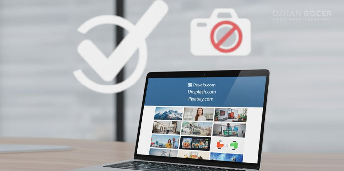
In my own practice, I track design shifts and build asset libraries using three primary online resources. You can study global style experiments through Behance Typography galleries, while Google Fonts provides the largest directory of 1500+ free fonts. For critical analysis of corporate identity updates, read Brand New (UnderConsideration). For current font-in-use inspiration, Typewolf is also valuable. For foundational theory, Robert Bringhurst's "The Elements of Typographic Style" remains the industry bible. Read it.
Finding the Right Style for Your Brand
Every one of the 15 styles works; your task is finding the exact match for you. In my own practice, I start this search by filtering options through a structured font selection process. I outline the 7 steps in my font choice guide. If you want to construct a complete visual hierarchy, read my typography guide; to understand the underlying mechanics, read what is a font. You can map out your broader market presence using my guide on corporate identity; select your brand tones with colors and their meanings; and finalize your mark using my resource on logo design.
If you want to execute a cohesive visual system directly, my graphic design services page explains how I structure my client engagements.
Send a creative style brief using the form in the bottom-right corner; the process takes three short steps, and I will reply within 24 hours.
Frequently Asked Questions
Quick answers for readers who skipped to the end.
What is the difference between writing style and font?
What is the Bauhaus style?
Which sectors fit Art Deco?
Who is the cyberpunk style for?
What is Brutalist web design?
What is the Y2K Renaissance style?
Which style is best for a minimalist brand?
Which style fits a kids' brand?
Which style fits a music brand?
Can variable fonts be used in creative styles?
What should I watch out for when picking a creative style?
What are the most creative type design schools?
How much does writing style affect brand recognition?
What is the anti-design / asymmetric style?
Is style selection alone enough?