- |
- ·
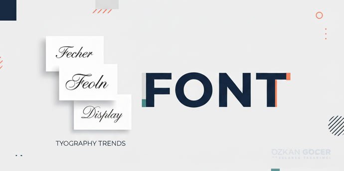
A font represents a specific character set defined by a precise combination of style + weight + size for letters, numbers, and symbols. For example, "Helvetica" is a typeface (family), whereas "Helvetica Bold 18pt" is a font. Modern web design relies on five core classifications: serif, sans-serif, slab-serif, display, and script. Professional font families include at least 4 weights (Regular, Medium, SemiBold, Bold); variable font formats pack 100+ weight variations into a single file. Standard font files average 30-150 KB. Slow loading times can degrade your page speed by up to 30%.
During my 15 years in graphic and web design, I have noticed that misusing the term "font" remains a persistent issue. Clients regularly say "font" when they actually mean typeface. Miscommunication delays projects. In my own practice, I break down the layers of the font concept, show classification families with clear examples, and provide practical, field-tested guidance. If you want to build a structured typography system, read my typography guide; to master the selection process, read font choice; to explore creative options, see my 15 impressive writing styles archive.
What Is a Font? A Plain Definition
In my own practice as a web specialist, I treat a font as a specific delivery mechanism of a typeface. Think of "Arial" as the design family, whereas "Arial Regular 12pt," "Arial Bold 14pt," and "Arial Italic 10pt" represent individual fonts. Physical metal typesetting once required separate physical molds for every single size and weight. Digital technology simplified scaling. The core distinction still matters for clean design. Details matter.
Everyday industry jargon frequently mixes these terms. Downloading "Roboto" from Google Fonts delivers a typeface containing 12 font files, including Regular, Light, Medium, Bold, Black, and their italic variants. Writing modern CSS reflects this structure directly. Your `font-family: 'Roboto'` property calls the typeface. Setting `font-weight: 700` targets the specific bold font.
The Anatomy of a Font: 10 Parts
Type design relies on structured geometry rather than random drawing. In my own practice optimizing websites, I have found that mastering typography anatomy directly impacts user readability and brand authority. You need to know these 10 terms to make informed design decisions.
- Cap height: The distance from the baseline to the top of flat capital letters.
- X-height: The height of lowercase letters excluding ascenders and descenders. Tall x-heights make small text readable.
- Baseline: The horizontal line where the base of most characters sits.
- Ascender: The vertical stroke of lowercase letters like "b" or "d" extending above the x-height.
- Descender: The portion of letters like "g" or "y" that projects below the baseline.
- Serif: The decorative stroke attached to the start or end of a letter stem.
- Counter: The empty space inside letters like "o" or "d," either fully or partially enclosed.
- Stroke: The primary line forming a character. Varying stroke thickness creates visual contrast.
- Aperture: The opening to a counter in letters like "c" or "e."
- Terminal: The end of any stroke that lacks a serif, often shaped like a teardrop or circle.
Selecting typefaces requires technical intent. In the projects I have managed, pairing a high x-height with wide apertures has consistently resolved mobile legibility issues. Newspapers favor Georgia over Times New Roman for this exact reason.
The 5 Core Font Classifications
1) Serif
Small decorative feet finish the main lines of serif letters. Print media built its legacy on them. In my own practice, I use them to establish immediate authority. Subtypes: Old Style (Garamond, Caslon), Transitional (Times, Baskerville), Modern (Bodoni, Didot), and Slab Serif (Rockwell, Roboto Slab). Brand examples: Vogue (Didot), Tiffany & Co. (traditional serif), and The Wall Street Journal (Old Style). Feel: Traditional, serious, reliable, and authoritative. Use: Newspapers, books, luxury branding, and academic publishing.
2) Sans-Serif
Clean ends without decorative projections define sans-serif typefaces. Modernist designers in the 1920s popularized this style to strip away historical weight. Clarity wins online. Subtypes: Grotesque (Helvetica, Arial), Neo-Grotesque (Inter, Roboto), Geometric (Futura, Avenir, Montserrat), and Humanist (Open Sans, Frutiger). Brand examples: Google (Roboto), Apple (San Francisco), and Spotify (Circular). Feel: Modern, clean, technological, and approachable. Use: Websites, mobile apps, corporate identities, and tech brands.
3) Slab Serif
Heavy, block-like terminals distinguish slab serifs from their delicate ancestors. Designers treat them as a standalone category due to their intense visual weight. They demand attention. Examples: Rockwell, Roboto Slab, Museo Slab, and Arvo. Brand examples: Sony, Volvo (classic logo), and IBM Plex Serif. Feel: Bold, solid, and a blend of modern and traditional aesthetics. Use: Editorial headlines, retro designs, and distinct brand identities.
4) Display
Exaggerated, highly stylized characters make display fonts suitable only for large-scale applications. Shrinking them ruins readability instantly. Keep them big. Subtypes: Decorative, Retro, Stencil, Outlined, and Distressed. Examples: Bebas Neue, Lobster, Impact, Anton, and Playfair Display. Use: Poster headlines, website hero sections, and packaging labels. Warning: Avoid using them for body text, as readability will suffer.
5) Script (Handwriting)
Fluid strokes in script fonts replicate human handwriting and formal calligraphy. In the projects I have managed, overusing these decorative styles always hurts conversion rates. Use with restraint. Subtypes: Formal Script (Edwardian, Snell Roundhand), Casual Script (Brush Script, Lobster), and Calligraphic (Allura, Sacramento). Feel: Personal, romantic, elegant, and artistic. Use: Wedding invitations, boutique cosmetics, creative branding, and holiday campaigns. Warning: Avoid using them for long paragraphs, as they quickly fatigue the reader.
Variable Font: The Standard Format of 2026
In my own practice, I used to load five different font files just to get light, regular, medium, bold, and extra bold weights. Modern web design relies on variable fonts using the OpenType 1.8+ format to bundle infinite design variations into one single file. It saves bandwidth.
- Performance: A single asset replaces multiple files, dropping your total font payload from 150KB to 70KB.
- Flexibility: You target exact, non-standard values like `font-weight: 423` directly in your CSS rules.
- Responsive typography: Font weights scale dynamically to match the viewport width.
- Browser support: Global compatibility exceeds 96% today.
Select Popular variable fonts like Inter, Recursive, Roboto Flex, Source Sans 3, and JetBrains Mono for your next project. You can source them directly from the Google Fonts variable collection. Learn the technical implementation steps by reading Google's web.dev typography guide.
Font Loading: Performance + SEO Impact
In the projects I have managed, poor typography setup routinely damages Core Web Vitals (CWV) metrics. Incorrect configurations trigger sudden layout shifts, directly hurting your Cumulative Layout Shift (CLS) and Largest Contentful Paint (LCP) scores. Fix errors early. You can find technical benchmarks in Smashing Magazine's font performance cheat sheet.
4 Loading Strategies
- Self-host: Yields maximum speed and data privacy. You download the files directly from Google Fonts and store them on your origin server.
- Google Fonts CDN: Delivers files quickly but introduces external requests, triggering General Data Protection Regulation (GDPR) compliance issues. European Union (EU) courts established this risk in a 2022 German legal ruling.
- Adobe Fonts (Typekit): Demands a paid yearly subscription. It provides access to a massive library, bundled with Adobe Creative Cloud.
- Variable font CDN: Serves assets via privacy-compliant networks. Platforms like jsDelivr and Bunny Fonts bypass GDPR issues.
Mandatory Performance Rules
- `font-display: swap`: Required in your CSS files. The property forces the browser to show a local system font immediately, switching to the custom font once loaded to stop layout shifts.
- Preload critical fonts: Prioritize above-the-fold assets. Implement `` in your document head.
- WOFF2 format only: Stick to modern compression. Legacy formats like TTF and EOT increase file sizes by approximately 30%.
- At most 2-3 weights: Restrict your font family variations. Loading display and body styles meets most design needs, while adding 5 weights bloats your page by 800KB.
- Subset: Strip unused character sets. Remove Cyrillic, Greek, and Arabic glyphs if you only target Latin alphabets. Latin and Latin-ext character sets support Turkish and Western languages perfectly.
Font Licensing: Commercial-Use Traps
In my own practice audit, I constantly find brands using unlicensed typography without realizing the legal liability. You must understand the four primary licensing models to avoid lawsuits; licensed sources like Adobe Fonts are one example.
- SIL Open Font License (OFL): Permits unrestricted commercial distribution and modification. Google Fonts relies heavily on this framework.
- Apache License: Grants free commercial rights with minor attribution rules. Roboto and Source Sans utilize this standard.
- Web font license (incl. Adobe Fonts): Charges recurring fees based on monthly pageview thresholds and permits online embedding.
- Desktop / OEM license: Covers local software installation, restricting usage to a specific number of workstations.
Unofficial download portals often distribute pirated assets disguised as freeware. Protect your business. Accessing Adobe Fonts via an active Creative Cloud subscription secures your commercial rights, while Google Fonts provides a safe, zero-cost alternative.
Moving into the Font Selection Process
In my own practice, I treat font selection as a technical audit where you balance target demographics, loading speeds, and licensing terms. Selecting typography requires strict alignment with your industry standards. My font choice guide breaks down this execution phase step by step. You can structure your visual hierarchy using my typography system guide, or study creative executions through the 15 impressive writing styles archive. Details matter.
A cohesive brand identity relies on seven distinct building blocks, with typography serving as one core element. You can analyze the complete framework in my corporate identity guide, map your brand psychology with colors and their meanings, and learn asset creation through my guide on logo design. For complete brand development, my graphic design services page details my collaborative workflow.
Send a font system brief through the form in the bottom-right corner; the process requires three short steps, and I will reply within 24 hours.
Frequently Asked Questions
Quick answers for readers who skipped to the end.
What is a font in one sentence?
What is the difference between font and typeface?
How many core font classifications exist?
What is a variable font and why does it matter?
How does font loading affect page speed?
What is WOFF2 and why use it?
Are Google Fonts free for commercial use?
Which fonts are free and which are licensed?
How many fonts should I pick for a brand?
What is the difference between serif and sans-serif?
What is a display font and when do I use it?
Are Turkish characters (ş, ğ, ı, ç, ö, ü) included in every font?
What is the point of font anatomy terms (x-height, ascender)?
How do I load a font in CSS?
Where does font selection fit in the design process?