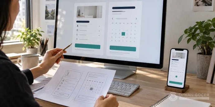
Consider an appointment page: someone chooses a service, checks a time, and confirms a request. Figma Design lets you explore the screen layout and transitions before developing the software. Your first exercise does not need an entire application. A booking-summary screen and a confirmation screen provide a manageable starting point.
What Is Figma Used For?
Figma Design supports interface layouts, prototype flows, reusable components, and sharing design details with a team. Designers, developers, product managers, and writers can examine the same file for different purposes. Permissions, plan limits, and product access determine what each person can do.
An attractive screen does not guarantee that someone can complete a task easily. Understanding UX and UI helps: the appearance of a button is an interface decision, while deciding when to ask for particular information belongs to the wider experience. Figma makes those decisions visible; it does not guarantee that they are correct.
Figma Design, FigJam, and Figma Make: What's the Difference?
Scroll sideways to read every column. Keyboard: focus the table and use the arrow keys.
| Tool | Main Job | When to Start Here |
|---|---|---|
| Figma Design | Interface editing and prototyping | You want to draw screens and connect interactions yourself |
| FigJam | Collaborative whiteboarding | You need to organize ideas, user steps, and notes |
| Figma Make | AI-assisted functional prototypes and applications | You want to develop an interactive experiment from a prompt or existing design |
| Figma Sites | Website design and publishing | You need a site using its supported publishing features |
Figma's product overview distinguishes these tools. Neither “Figma only draws pictures” nor “every Figma file is a working website” describes the full picture. The exercise below uses Figma Design without requiring an AI prompt.
Is Figma Free?
Yes. As checked on October 2, 2026, the Starter plan includes unlimited personal drafts. Its single team folder allows three Figma Design/Figma Sites files in total, with separate three-file limits for FigJam and Slides. Invited collaborators can view Starter drafts. Cross-file team libraries and Dev Mode are not included in Starter.
Start by checking whether the free plan meets your learning needs. Paid access depends on both the plan and the seat type: Full supports design work, Dev supports developer workflows, and Collab supports relevant collaboration products. Someone who only reviews and comments does not automatically need a Full seat.
Check current pricing with your country, taxes, seat count, and monthly or annual billing selection. The monthly equivalent of an annual commitment is different from a monthly subscription price. Also check AI credits for Make and publishing access for Sites: a free account does not provide unlimited access to every product.
Your First Design: A Two-Screen Booking Prototype
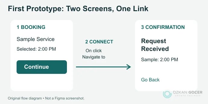
Exercise goal: The user reads a fixed sample appointment time and clicks “Continue” to open a confirmation screen. The exercise does not implement time selection, save a real appointment, take payment, or collect personal information. Dimensions and wording are examples for practice.
1. Create a Design File and Two Frames
Open a new Design file in your Figma account. Select the Frame tool in the toolbar or press F. Create two top-level frames side by side and name them “Booking” and “Confirmation.” You could use 390 × 844 for both; this is a practice size, not a universal phone standard. A frame contains text and images, rather than simply drawing a border around them.
2. Arrange the Content First
On the first screen, add a heading, a sample service name, a “2:00 PM” time label, and a “Continue” button. On the second, add “Request Received,” a summary of the selected time, and a way back. Leave photography and decorative effects until later; the immediate task is making the choice and next step understandable. Use typography principles to guide text sizes and reading order.
3. Build the Button With Auto Layout
Select the button label and press Shift + A to add auto layout. Set a fill and padding, and set the width to Hug contents so it grows with the text. Change the label to “Send Appointment Request.” If the text overflows, inspect sizing and padding again. Auto layout responds to content changes in the design; it does not automatically implement a responsive live website.
4. Connect the Button to the Confirmation Screen
In the Prototype tab, select the button and drag its connection to the “Confirmation” frame. Use On click as the trigger and Navigate to as the action. The destination should be the second frame directly on the canvas. Keep the first transition simple. Figma's prototyping documentation explains starting points, destinations, and interactions.
5. Ask Someone Else to Try the Flow
Use the same connection method to link the return control to the “Booking” frame. Start the preview at “Booking” and check both directions. Then ask someone to complete the sample request for the displayed time without explaining where to click. Watch which element they approach and record their hesitation and wording; asking only whether they like it will tell you less.
What Do Components and Libraries Do?
If several screens share the same button, create a component and use linked instances. The main component manages shared properties; local overrides and detached instances can affect the result. An ordinary duplicate is not necessarily a linked component instance.
For sharing across files, use published libraries. Changes must be published and applied in the consuming files. Do not assume that editing one button has silently updated every project before delivery.
Figma, Canva, or Photoshop?
Consider Figma Design for screen states, reusable components, and clickable flows. If ready-made social graphics or presentation templates are your priority, compare Canva's use cases. Detailed photographic retouching may require a dedicated raster editor. Teams can reasonably use several tools for different jobs; Figma is not mandatory for every design task.
What Should You Hand Over to a Developer?
Prepare named screens, a working prototype link, component states, and behavior notes instead of sending screenshots alone. Include empty, error, loading, and long-text states. A working button in a Design prototype does not mean authentication, data storage, accessibility, and security have been implemented. Dev Mode supports inspection; the actual product still needs development and testing.
For static assets, select the relevant frame or object and use its Export settings. PNG, JPG, SVG, and PDF serve different delivery needs. Keep the vector–raster distinction in mind for icons and photographs; exporting everything as an enormous PNG is unnecessary.
Finish the exercise with two understandable screens, a working transition, and a list of observed issues to revise. Applying the investigation, testing, and revision steps of the design process gives you a more concrete starting point than memorizing a long list of tools.