A logo can look impressive on a large display and become unreadable in a social profile. A simple wordmark, meanwhile, can work well with carefully spaced lettering. Judge the design outside its presentation mockup: can people read the name, distinguish it from similar businesses, and use it in the intended space?
What Is the Difference Between a Logo, an Emblem and a Brand?
Logo is the broad everyday term for a visual identifier. A wordmark or logotype presents the brand name through lettering. A symbol can work with or without that name. In English, an emblem logo often combines text and imagery inside a badge or enclosed composition. Discuss an example when agreeing terminology with a designer; the same words can be used differently across languages.
A brand includes much more: the work a business delivers, the experience people have, its communication and its visual consistency. The logo does not have to explain every part. A bakery need not fit bread, wheat, an oven, a chef's hat and its founding story into one small mark. Choosing one recognizable idea leaves the rest of the identity room to communicate.
Which Type of Logo Fits the Job?
Scroll sideways to read every column. Keyboard: focus the table and use the arrow keys.
| Approach | What It Uses | Question to Check |
|---|---|---|
| Wordmark | The brand name in distinctive or customized lettering | Does the name remain readable at its smallest intended size? |
| Lettermark or monogram | Initials or an abbreviation | How will someone unfamiliar with the initials learn the name? |
| Symbol | A pictorial or abstract mark | Can it stand alone, or does the name need to accompany it? |
| Combination mark | A name and symbol used together or separately | Do horizontal, stacked and small versions remain related? |
| Emblem or badge | Lettering and imagery in an enclosed arrangement | Will borders and small lettering fill in during production? |
These categories overlap; they are not a fixed taxonomy that every designer must follow. An unfamiliar business may benefit from a version that includes its name alongside a symbol. Select the structure for the use case instead of assuming that one category is inherently more professional.
How to Design a Logo: 7 Steps from Brief to Delivery
1. Write a One-Page Logo Brief
A brief defines the job the design must do. Include the exact business name, offer, audience, similar brands, intended placements and delivery requirements. “Make it modern” offers little guidance. “The short name must remain readable on a phone and on a small product label” describes a decision the designer can test.
- What is the exact name, and is there a tagline or another language version?
- What need brings people to this business?
- Where will the logo appear most often, and at roughly what sizes?
- Must an existing color, letterform or symbol be retained?
- Who approves the work, and which files are needed?
Example brief: An imaginary bicycle repair workshop needs its short name on a sign and booking page, plus a symbol for its social profile. Combining a wheel, bicycle and wrench into one shape is optional. This is a teaching example, not a completed client project.
2. Research Similar Brands Without Collecting Parts to Copy
Place comparable businesses' names, colors and symbols beside one another. Look for repeated conventions and potentially confusing similarities. Describe what interests you in a reference: “solid shapes instead of fine lines” is more useful than “make this logo ours.” Borrowing several recognizable pieces does not necessarily produce a distinctive result.
An initial visual comparison is not a clearance or trademark search. Before investing in a rollout or print run, arrange an appropriate check for the relevant market. Looking original does not by itself establish that a mark can be used legally.
3. Explore Black-and-White Sketches Before Color
Try several different ideas on paper. Recoloring the same shape does not create a separate design direction. One approach might explore a relationship between letters; another might use a single symbolic idea. More sketches can help exploration, but reaching a prescribed number is not a quality test.
Remove the color, shadows and presentation effects. Does the idea still make sense? If not, revisit the form before polishing the file. Adobe's logo design guidance likewise includes single-color and small-scale use as practical considerations.
4. Build the Chosen Idea as Vector Artwork
Refine letter spacing, stroke weight and the gaps between shapes. Automatic alignment is useful, but equal geometric measurements do not always look equal: round and square forms can appear different in size. Compare the visible result as well as the coordinates.
An editable vector master keeps scaling and production options open. Putting a JPEG inside an SVG does not convert its contents into editable paths. The difference between vector and raster graphics matters when checking the actual source file, not just its extension.
5. Choose Type and Color in Context
Test the characters the name needs, including accents or another language's letters. For a Turkish version, that includes ç, ğ, ı, İ, ö, ş and ü. If thin lettering disappears on a label, choose a more suitable weight or prepare a separate small-use version. Check the font's commercial-use and file-sharing conditions before handing it over.
Think in terms of a main color, supporting colors and neutral backgrounds. A logo does not require three colors; a monochrome solution may be enough. Palette tools can help compare options and test text against its background. A color used successfully in the logo should not automatically become the color of every paragraph on the website.
6. Test Small Sizes, One-Color Output and Backgrounds
Take the design out of the enlarged drawing canvas. Inspect it in a website header, profile image, small label and single-color output, according to the brief. Rather than requiring a detailed wordmark to remain readable at 16×16 pixels, prepare a simplified symbol when a favicon calls for one.
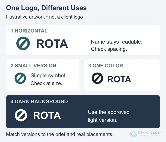
The diagram shows how one idea can have several arrangements. Check name readability, closing gaps, cropping and visibility on light and dark backgrounds separately. A polished sign mockup does not complete those checks. If print production is involved, request a proof using the relevant material and process.
7. Record Approval and Deliver the Right Files
Approval should identify the versions, colors, tested minimum sizes and files being supplied. State a size limit for the version you actually tested; there is no universal minimum for every logo. Agree the revision scope and decision-maker early enough to avoid incompatible feedback at the end.
Scroll sideways to read every column. Keyboard: focus the table and use the arrow keys.
| File | Purpose | Check |
|---|---|---|
| Editable source | Future changes | Paths, layers and font dependencies |
| SVG | Suitable web and interface placements | Embedded raster content, unnecessary objects and browser output |
| The printer's agreed workflow | Required color profile and the objects inside the document | |
| Transparent PNG | Presentations or placements that cannot use vectors | Pixel dimensions, clean edges and transparency |
A JPEG-only delivery can make it difficult to remove the background or edit the geometry. Equally, not every project needs every format. Use clear filenames such as brand-horizontal-dark.svg, and include a short note showing which version belongs on which background.
Can You Make a Logo for Free? Software, Templates and AI
Inkscape is a free, open-source vector editor. Illustrator is another option for vector drawing; the choice depends on budget, familiarity and delivery requirements. Browser-based logo builders can provide a quick starting point, but a free preview does not necessarily include a high-resolution or editable download.
When using Canva, read its explanation of logo usage and trademarking. Shared stock graphics and templates are not exclusive to your business. Uploading your own original artwork is a different situation from turning a library graphic into the identifying mark.
AI can help explore ideas or alternative arrangements. Before treating an output as a deliverable, inspect spelling, similarities, gaps and the actual file structure. An example prompt is: “Describe three distinct single-color symbol ideas for an imaginary bicycle repair workshop and explain each choice; avoid imitating known brand marks.” It is a starting instruction, not a guarantee of originality or suitability. Treat 3D embossing and shadows as presentation options, separate from the usable master artwork.
What Determines Logo Design Cost and Timing?
Compare research scope, design directions, revision limits, delivery formats and usage terms when reviewing a quote. Editing a template is a different deliverable from developing original artwork and checking several applications. A universal price range without current, comparable proposals would be misleading.
Timing also depends on whether the name is settled, how many people approve the work, how quickly feedback arrives and whether production proofs are needed. Share the brief and real placements when requesting a proposal. You can review my logo and visual identity design service before discussing the scope; deliverables and scheduling should follow the actual requirements.