- |
- ·
The web design trends of 2026 are about performance, personalization, and accessibility as much as flashy visuals. Below you will find the forces shaping design this year, AI-driven personalization, bento grid layouts, micro-interactions, dark mode and bold typography, sustainable and accessible design, and most importantly the balance of speed and SEO when applying trends.
What's Shaping Web Design in 2026
In 2026, web design is shaped less by a single fashion and more by the intersection of three forces: AI, performance, and accessibility. The standout trends, in short, are:
- AI-driven personalization: adapting content and experience to each visitor.
- Bento grid layouts: modular, balanced, easy-to-scan box structures.
- Micro-interactions: feedback through small, meaningful motion.
- Dark mode and bold typography: comfort and a strong visual identity.
- Sustainable and accessible design: light, fast pages usable by everyone.
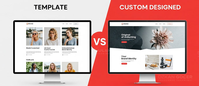
Let us start with an important caveat: a trend should be a means, not an end. One that does not fit your brand or audience can hurt the experience, so judge each by "who it suits and who it does not." I cover the fundamentals in my what is web design article.
AI Personalization and Agentic Web Experiences
The year's most pronounced trend is AI-driven personalization. Instead of showing every visitor the same page, sites now adapt content and experience to behavior and context; product recommendations, dynamic headlines, and smart search are examples. On top of that, "agentic" experiences are rising: designing clear-structured, machine-readable sites that work with AI assistants acting on a user's behalf is gaining importance. I explain the basics in my what is artificial intelligence article.
In practice, even small businesses can benefit from simple personalization: content by location, a different message for a returning visitor, or products highlighted by interest. What matters is that personalization adds value for the user without making them feel watched; so be mindful of data privacy and a clean default experience.
Bento Grids and Modular Layouts
A bento grid places content into boxes of varying sizes, resembling a bento lunchbox, in a modular and balanced layout. It makes information easy for the scanning eye, works flexibly on both desktop and mobile, and presents different content types (image, text, stats) together in an orderly way. It works especially well on homepages and product showcases. When applying it, clarify the boxes' hierarchy and make sure it collapses cleanly to a single column on mobile, because a poorly built grid can fall apart on phones; design sources offer current examples.
Micro-interactions and Motion Design
Micro-interactions are small but meaningful motions, like the feedback when a button is pressed, animations that appear on scroll, and hover effects. Used well, they make an interface feel alive and intuitive and help the user understand what happened. Motion design serves the same purpose: it guides attention and smooths transitions. The key balance is this: effects should support the experience, not show off. Excessive or heavy animation both distracts and hurts performance, so keep it simple and purposeful; UX sources study good examples.
Dark Mode, Bold Typography, and Vivid Colors
Dark mode is no longer mandatory but has become an expected option; offering light and dark themes raises user comfort and gives a modern impression, especially valuable on sites people stay on for long periods. Bold typography and vivid colors help brands stand out in the crowd: large, characterful headlines and strong color contrasts build a clear identity. A tactile "brutalism" trend also draws attention with raw layouts and pronounced typography. I cover type choice in my typography article and the effect of color on a brand in my colors and meanings article; use all three in moderation, without breaking readability and contrast.
Sustainable and Accessible by Default
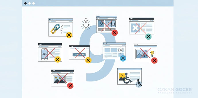
Sustainable web design means building light, fast pages that use less data and energy; optimized images, lean code, and efficient hosting reduce both environmental impact and load time. Accessibility is a "trend" that is increasingly a requirement: sufficient contrast, keyboard navigation, readability, and alternative text let everyone use the site and also support SEO and legal compliance. You can find the principles in the W3C accessibility guidelines.
Accessible design is not an extra cost but a way to reach a wider audience; users on screen readers, navigating by keyboard, or with low vision are customers too. A light, accessible site is at once faster, greener, and open to more people.
Reality Check: Trends vs Performance and Accessibility
Here is the most important part: when applying trends, do not sacrifice speed and SEO. Heavy 3D visuals, excessive animation, and huge files can raise load times and harm Core Web Vitals, which hurts both users and rankings. Optimize effects, simplify on mobile, and before adding any trend, ask "does it serve the user and conversion?" Track performance through Core Web Vitals; a well-designed site serves the user, not the fashion, and is fast and accessible. Use a trend where it serves a purpose, not blindly.
Frequently Asked Questions
Quick answers for readers who skipped to the end.
What's the biggest web design trend in 2026?
Should I apply every trend to my site?
Do animations and visual effects slow my site down?
Is dark mode mandatory now?
What is a bento grid layout?
What does sustainable web design mean?
Is accessibility a trend or a requirement?