A contact form can look tidy while preventing someone from sending it. The submit button may be unreachable by keyboard, an error may appear only as a color change, or a screen reader may announce a field without its name. Those are concrete barriers you can investigate and fix.
What Is WCAG, and Which Level Should You Use?
WCAG stands for Web Content Accessibility Guidelines, published by the W3C. WCAG 2.2 assigns success criteria to Levels A, AA and AAA. A Level AA target includes the applicable A and AA criteria together. Passing a handful of checks is not enough to claim that level of conformance.
The four principles are perceivable, operable, understandable and robust, often abbreviated to POUR. Captions help people perceive speech; keyboard support enables operation; clear errors aid understanding; correct names and roles support assistive technologies. The W3C introduction to accessibility places the needs of people with disabilities at the center of these technical decisions.
Set the project's technical target alongside its contract, organizational policy and applicable requirements. The following nine checks are an initial review informed by WCAG 2.2, not a substitute for evaluating all relevant criteria.
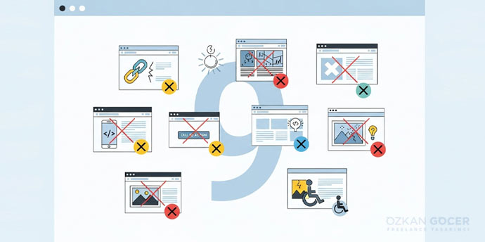
9 Accessibility Checks to Run on Your Website
1. Complete a Task Using Only the Keyboard
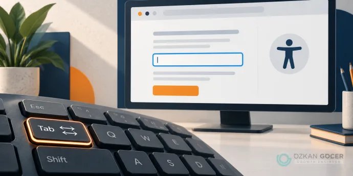
Choose a task, such as opening the contact page and submitting its form. Use Tab to move forward and Shift+Tab to go back. Activate links with Enter and buttons with Enter or Space; some controls also use arrow keys. Menus, dialogs and forms must remain operable, without trapping focus where you cannot leave. Keyboard navigation involves more than the Tab key alone.
The keyboard criterion covers functionality operated through a keyboard interface, with exceptions for path-dependent input such as freehand drawing. Plan separate checks for mobile browsers and the assistive technologies your audience uses. One completed desktop task does not validate every device.
2. Keep the Focused Control Visible
After pressing Tab, you should be able to tell which link or control is active. Removing the focus outline without a visible replacement makes keyboard navigation difficult. Test with sticky headers and cookie notices present as well.
WCAG 2.2 AA criterion 2.4.11 requires the focused component not to be entirely hidden by author-created content. Keeping it completely visible is a stronger design goal. Distinguish that goal from the minimum AA wording.
3. Measure Text and Control Contrast
Normal text needs at least 4.5:1 contrast against its background; large text needs 3:1. The criterion defines large text as at least 18 pt, or 14 pt when bold: approximately 24 and 18.67 CSS pixels respectively. Exceptions, including logotypes and inactive controls, are described in Understanding 1.4.3.
Check help text, errors, links and changing backgrounds, not just the main paragraph. Visual information needed to identify a control or its state also falls under the separate 3:1 non-text contrast criterion. This does not require a visible border around every button. Communicate a state with text, shape or another cue as well as color.
4. Enlarge Text and Check a Narrow Layout
Text should be resizable to 200% without losing content or functionality. Separately, inspect vertically flowing content at a width of 320 CSS pixels: do readers have to scroll sideways repeatedly to read ordinary text? Text resizing and reflow are distinct requirements. Content that needs a two-dimensional layout, such as a map or data table, has exceptions.
Clipped headings, overlapping fields and an unreachable submit button need attention. Consider the layout through responsive design, and review font characteristics and weights when text becomes difficult to use.
5. Check Form Labels, Errors and Confirmation Together
The name of a field should not disappear when someone begins typing. Provide a visible label and a programmatic relationship to its control. With explicit labeling, the label's for value matches the input's id. A placeholder does not replace a persistent label. The W3C's form labeling examples show that connection.
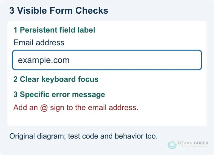
Check the three numbered details in your own form: 1 does the field name remain visible; 2 is keyboard focus clear; 3 does the error explain what to correct? “The email address needs an @ sign” gives someone a useful action, unlike “Invalid value.” Preserve other correctly entered information.
Form feedback covers both failure and success. Associate an error with its field so assistive technologies can identify the relationship, and test dynamic announcements or focus management with an actual screen reader. Announcing every small change as an urgent alert can create its own obstacle.
6. Write Image Alternatives for Their Purpose
Describe an informative image according to its role on the page. Use alt="" for a purely decorative image. If an image is the only content of a link, its alternative should communicate the destination or action. Put the information in a complex chart into accessible page text as well. The W3C alt decision tree helps you choose an approach based on purpose.
A filename or list of keywords is not a useful description. A product photograph may need the product and its relevant visible feature described; an image acting as the sole “buy” control needs its action communicated.
7. Review Headings, Language and HTML Elements
Large-looking text is not automatically an HTML heading. Heading levels should reflect the relationship between sections, and lang should identify the page's language. Use a button for an action and a link for navigation. The meaning of HTML elements supplies structure beneath the visual layout.
Adding role="button" to a div does not give it keyboard behavior automatically. Use a suitable native element when available. When adding names, roles or states with ARIA, test the behavior as well. Navigating headings and fields with a screen reader can reveal problems that a visual review misses.
8. Try Small Targets and Media Controls
Closely packed icons can make it difficult to select the intended action. WCAG 2.2 AA's target-size criterion uses 24 by 24 CSS pixels, with exceptions for sufficient spacing, equivalent controls, inline links and other cases. It does not mean every text link must be 24 pixels tall. Aim for comfortable interaction areas around important controls.
For video, check captions for speech and meaningful sounds. Provide transcripts for audio and suitable descriptions for necessary information conveyed only visually. The player must also work with the keyboard. Accessible media planning helps you select alternatives based on the content. Include pausing movement and handling time-limited tasks in the review.
9. Validate Automated Findings and Record the Problem
Tools such as Lighthouse, WAVE and axe can identify some problems; zero findings does not establish full accessibility. A scan score cannot determine whether an alternative text is meaningful, a task is completable or an error is understandable. The W3C's first-review guidance explicitly preserves the need for a more comprehensive assessment.
Record the URL, date, browser and device, assistive technology, steps to reproduce, expected behavior and observed result. Add an owner and the retest outcome. “Keyboard focus cannot leave the cookie notice, so the submit button is unreachable” is more actionable than “the form is broken.”
Are Accessibility, SEO and Legal Compliance the Same?
No. Descriptive image alternatives can help both users and image understanding; Google's image guidance explains that context. Keyboard support or an audit score does not provide a ranking guarantee. Crawling, canonical URLs and indexing still need separate technical SEO checks.
Legal scope depends on jurisdiction and the organization's activities. In Turkey, the Ministry announcement about Circular 2025/10 explains the covered organizations and monitoring structure. Establish the requirements for your organization using current official texts and the conditions that apply to it. This introductory checklist is not a legal compliance report.
Which Fix Should Come First?
Start with barriers that stop an important task altogether: a menu that cannot open, a form that cannot be submitted or a dialog that cannot close. Then address shared components repeated across pages. Fixing the source template avoids maintaining a separate patch for every occurrence.
Bring accessibility into the UX/UI design process early. Retest the task before the next release and extend the evaluation with disabled participants where possible. The practical goal is for a person to finish what they came to do, rather than for a report to display a favorable score.